Running for office involves a lot more than simply creating signs with attractive graphics. However, these seemingly ubiquitous signs do create impressions. Now that the recent election is over, let’s examine the effectiveness of various local politicians’ signage in this totally non-scientific analysis.
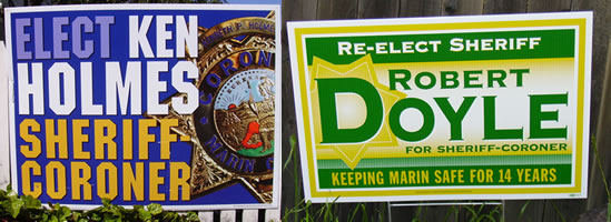
The first set of signs is for a new political office: Sheriff-Coroner. Who would you vote for (and why)? If you’re satisfied with the status quo, you’d likely vote for Robert Doyle, who mentions the key benefits “Keeping Marin Safe For 14 Years” and reinforces his insider-ness (“Re-Elect Sheriff”). If you wanted the image of bold/confident, then Ken Holmes’ sign (with the blue background and prominent shield) would suit you. Election winner: Robert Doyle.
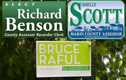
Based solely on these signs, who would you elect for Assessor (and why)? The strongest graphics are for Bruce Raful. Shelly Scott’s background imagery reflects a stylized version of the community. Richard Benson’s is generic. None of the signs show any compelling taglines nor benefits to electing them. Election winner: Shelly Scott.
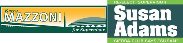
Based solely on these signs, who would you elect for Supervisor (and why)? Susan Adams’ sign is similar to Robert Doyle’s (above): a re-elect message and an endorsement by a well-known organization. Kerry Mazzoni’s stylized imagery shows the physical location of the civic enter, but doesn’t provide any message for why to elect her. Election winner: Susan Adams.
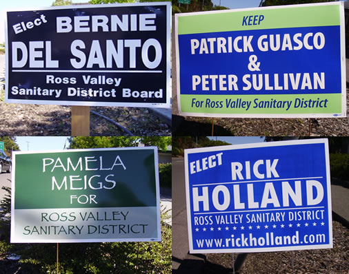
Finally, looking solely at these signs in this vote-for-three election for the Ross Valley Sanitary District who would you elect (and why)? Patrick Guasco & Peter Sullivan use the word “Keep” to imply incumbency. Bernie Del Santo and Rick Holland’s signs are pretty much interchangeable. Rick Holland makes his website’s URL prominent – for what purpose? People won’t look up a URL unless they have a compelling reason to do so, which his sign didn’t provide. Pamela Meigs sign stands out not because her message (which is equivalent to Bernie Del Santo and Rick Holland’s) but because of the font choice she made. It’s a lighter weight font that’s modern and non-corporate looking. Winner: Patrick Guasco, Peter Sullivan, and Pamela Meigs.
Good analysis based only on the design of the signs. I think the real purpose of local political campaign signs is to demonstrate how popular a candidate is by placing a large number of them on residents’ lawns. You drive down your own street seeing several of your neighbors sporting a particular candidate’s sign and think s/he must be good if many of my neighbors are supporting him or her. Otherwise they contribute little to voter education, only to end up in local landfills after the votes are counted.